In the world of print, typography is much more than a matter of aesthetic choice; it's at the heart of how your message is perceived and understood. A good typographic choice can elevate your project, while an unwise one can compromise it. With a plethora of fonts available, selecting the right one can be a complex task. This article explores the key considerations for choosing the typography that not only complements your design but also reinforces the message you wish to communicate.
Understanding the Impact of Typography
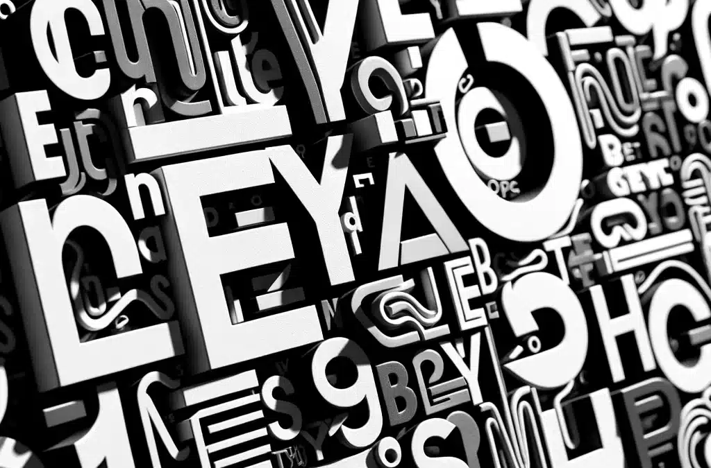
Typography influences the readability, mood and even credibility of your printed content. The typefaces with which you choose to present your text can profoundly affect the way your audience engages with your message. For example, an elegant, refined typeface can lend an air of luxury, while a more robust, down-to-earth font can evoke reliability and accessibility.
Fundamentals of Typographic Choice
Legibility and Visibility: Make sure the font you select is easy to read at different sizes and on different media. Print projects often require a variety of font sizes, and your choice must be legible, whether it's a large headline or a small body of text.
Brand suitability
Typography should reflect your brand's identity and the tone of your message. A young, dynamic brand might opt for a bold, modern font, while a more traditional institution might prefer a classic, streamlined typography.
Contrast and Hierarchy
Use different fonts (usually no more than three) to establish a clear visual hierarchy in your design. Contrast between headings, subheadings and body text helps guide the reader intuitively through the content.
Originality
In a saturated market, standing out can be a challenge. Choosing a unique (yet legible) typeface can help your print project stand out from the crowd.
Testing and experimenting
Before finalizing your choice, it's crucial to test the typeface in various contexts. This includes printing proofs to assess how the font will look on the final substrate and in actual lighting conditions. Don't hesitate to experiment with different combinations of fonts and layouts to find the perfect balance.
Conclusion
Typography, A Key Component of Your Project The choice of typography in your print projects should not be taken lightly. Well-chosen typography can not only enhance the aesthetics of your project, but also increase its impact and clarity. By considering legibility, brand fit, contrast, and originality, you can select typography that elevates your message and resonates with your audience. Remember, typography speaks even before words are read; make sure it speaks in the right tone.